Imagine you are on hold waiting to talk to a customer service agent at your internet service provider. Right now your internet is out, and your family is dangerously close to mutiny. Every second counts.
Finally, after a ten minute wait, with your nerves at the very breaking point, an agent gets on the phone. You can’t help yourself, you let loose a tirade of profanities and make sure they know a ten minute wait is completely unacceptable! To which the agent calmly replies, “But sir, our average wait time is only two minutes!”
That response probably didn’t make you feel better. Humans need to generalize things, it’s how we make sense of a world full of variables. But we very frequently misuse and misunderstand averages.
An average, also called the arithmetic mean, is one of several ways to understand central tendency in a dataset. It’s a way to generalize what is “typical.” The problem is that when looking at metrics related to your customers it’s too easy to believe that an average is what your users are experiencing, and that is almost never true.
Why are you generalizing?
One of my biggest takeaways with my recent foray back into studying statistics is that the real challenge is knowing when to use a particular approach with data, not the actual formulas themselves. Applying critical thinking to understand what a given function does is far more important and error prone than just plugging numbers in to a formula. Therefore the first thing to ask is, why am I trying to generalize this data?
We’re going to be thinking about pageload times as an example throughout this article, but you can apply this to any user experience related metric. Pageload time refers to the amount of time it takes from when a user clicks a link to when the page is up and ready for them to interact with it. This is very often presented as an average when using monitoring tools.
That’s actually fine most of the time, because typically those monitoring tools are used to keep an eye on the overall system health, so they are looking at a rolling interval (usually a minute or less). Meaning, the system is adding up all the pageload times it detects in a one minute interval and dividing by the number of pageloads, then that value is presented as the next entry on a graph. If that average suddenly spikes it can indicate something in the system changed.
The problem occurs when someone looks at that graph and assumes that it means that all users are experiencing that value as the time it took to load their page. That is not true. But in making that jump, the purpose for generalizing changed. They aren’t trying to look at a complex system to find abrupt changes. They wanted to know what people were feeling when they used the system, and you can’t use averages to learn that.
Shape matters - understanding distributions
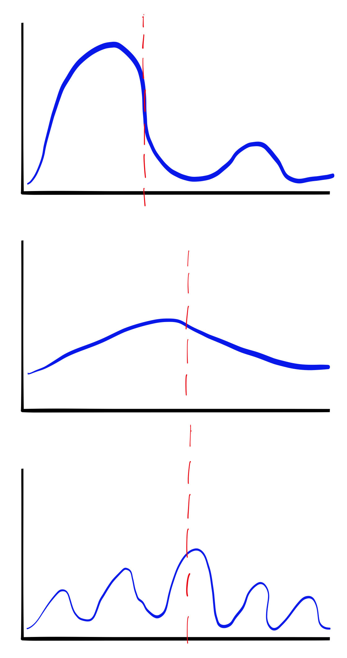
You have to remember that distributions can take lots of different shapes. Is it wide and flat, or tall and skinny? Evenly distributed or spiky? Does it skew to the left or right? Is there more than one peak? How badly an average value represents user experience heavily depends on these things.

If these distributions represented buckets of pageload times, you can see how the average (the red line) does a very poor job of representing what your users are experiencing. If all you tracked was the daily average pageload time, you wouldn’t even know that the times were varying like this throughout the day.
Averages hide things that piss off users
People who abandon their shopping cart, stop reading a blog post halfway (not you, dear reader), or switch to a competitor are usually not having an average experience (hopefully). If your goal is to reduce churn, looking at averages is a distraction.
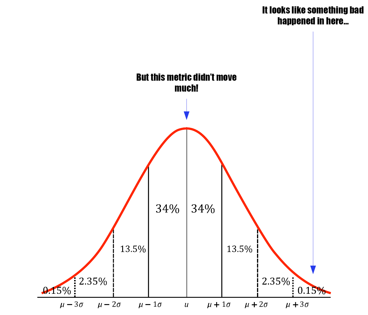
If your dataset is large, like pageloads for a busy website, then outliers have less and less of an effect on the average. In this way, the average value hides important facts about your user’s experience from you.
Why does that matter?
You might be thinking “But Lee, I don’t care if a few people have a bad experience as long as most people’s is okay.” That’s fair, but what if those few people are all in a new customer segment you care about a lot? Maybe you are trying to expand to a new region. If you look at an average that includes every customer you may not notice that 99% of your new segment is having a bad experience because the ISP in that area is really bad and they can’t get to your website reliably.
Use percentiles and frequency tables
A much better way to understand the experience people are having is to use histograms that show frequency tables of “bins” or ranges of experience. In this way you can understand much better what the “tails” of your experiences are and how many people are having them, rather than trying to generalize about the typical experience.
Another, even easier way to understand the extremes is to look at Percentiles. A Percentile shows you the max value that a percentage of the samples falls under. So if you look at the 99th percentile, it shows you the max value that falls under 99% of the samples. It also means that 1% of the samples are even worse than that number. It lets you quickly understand what the tail of your pageload times are, and what the worst experiences people are having are like. These are the experiences that lead to churn or other bad outcomes, and understanding what causes them is critical in keeping the overall system in check.
In my experience an uptick in user complaints very often correlates to a change in the higher percentile values. This is because in large datasets you can shift the P99 a lot and only affect the average a little bit. Changes in P99 are also often a prelude to a failure in a downstream system because dependencies don’t often tolerate large fluctuations in timing or success rate.
The next time you’re analyzing user metrics, challenge yourself to go beyond averages. Use percentiles and distributions to uncover the hidden stories in your data and make better decisions for your users.
